Liputan6 App is a news application that delivers up-to-date content, including a list of articles, interactive videos, and photos. This app edition is designed for users who enjoy reading news from the Liputan6 website but want a distraction-free experience — no ads, no missed daily headlines, just accurate and timely news.
Problem
Upon joining Liputan6 as a mobile designer, I discovered a lack of design system or documentation. A quick audit of the app revealed several core issues:
Typography was inconsistent, with multiple typefaces and unclear hierarchy
Spacing, sizing, and layout lacked uniformity
Components were being redesigned repeatedly, leading to inefficiency and visual inconsistency
There were no clear guidelines for color, imagery, or UI elements
The overall UI felt heavy and cluttered
Iconography styles were mixed (bold vs thin), reducing visual harmony
Challenge
How can I create a design system that is simple and understandable?
Research
I wish I was born with the ability to create design systems. When I started, I had no idea how to organize all my components. Luckily, many great companies like Shopify, Gojek, and Bukalapak shared publicly their design system so I could learn from them.
Define & Ideation: How can I make this documented and consistent?
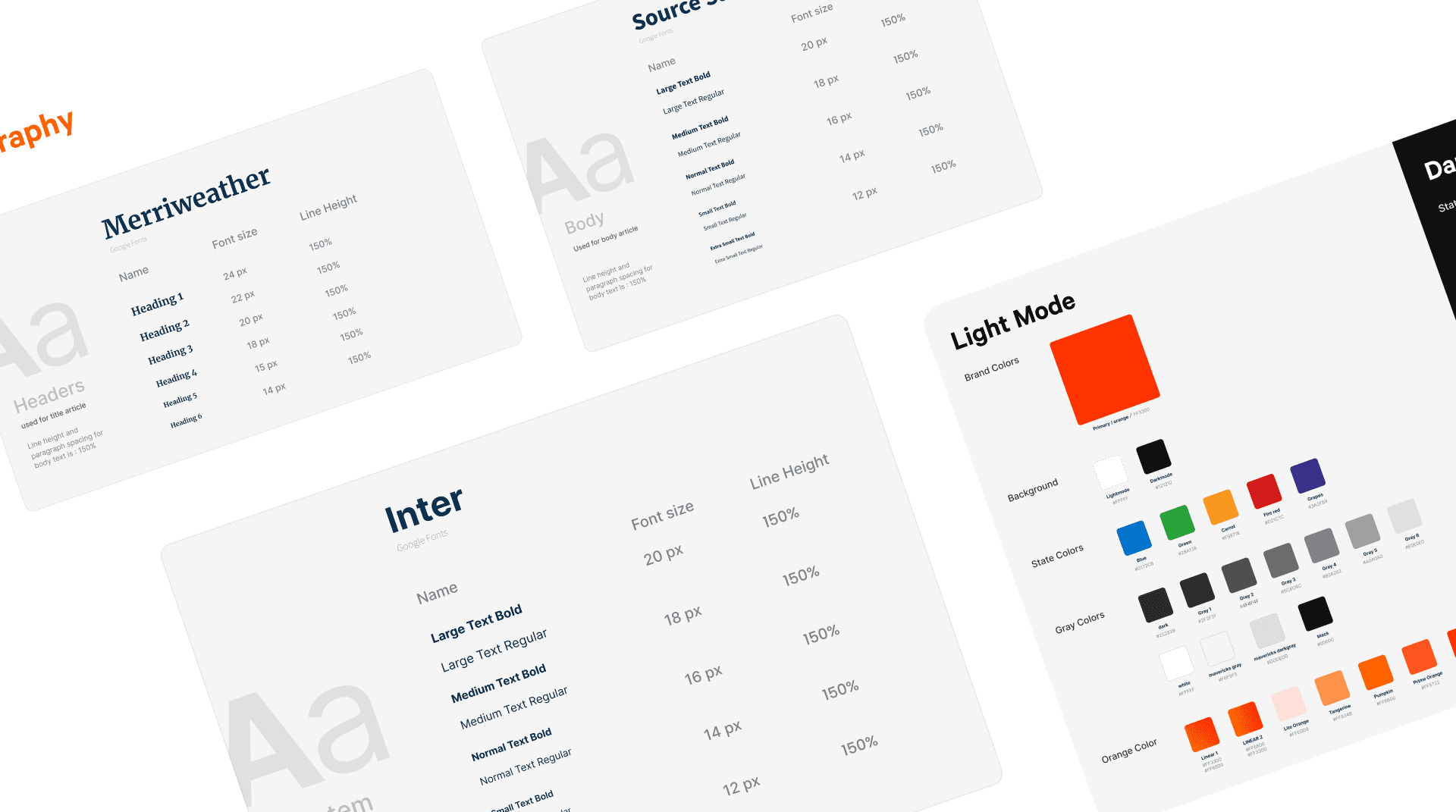
Started with creating a style guide for the system, collecting the available components, make variable and variant. collected into 1 Figma design system file which then for every new feature design, and make it as design library. collecting master components into the library file and regularly updating each component into the library.
So, starting to gather components, and update icons, in parallel with multiple revamps and launching dark mode, I update one by one from typography, color, icons, illustration kit, empty state, and other components
From here I learned atomic design principles although still very minimal, using component properties to simplify variants. It’s still an ongoing learning experience to identify which components will be needed for reuse and which elements are specific for edge cases.
How It Work
The design system is still in progress, and constantly being iterated on. With the new components that were implemented, has it improved the overall product?
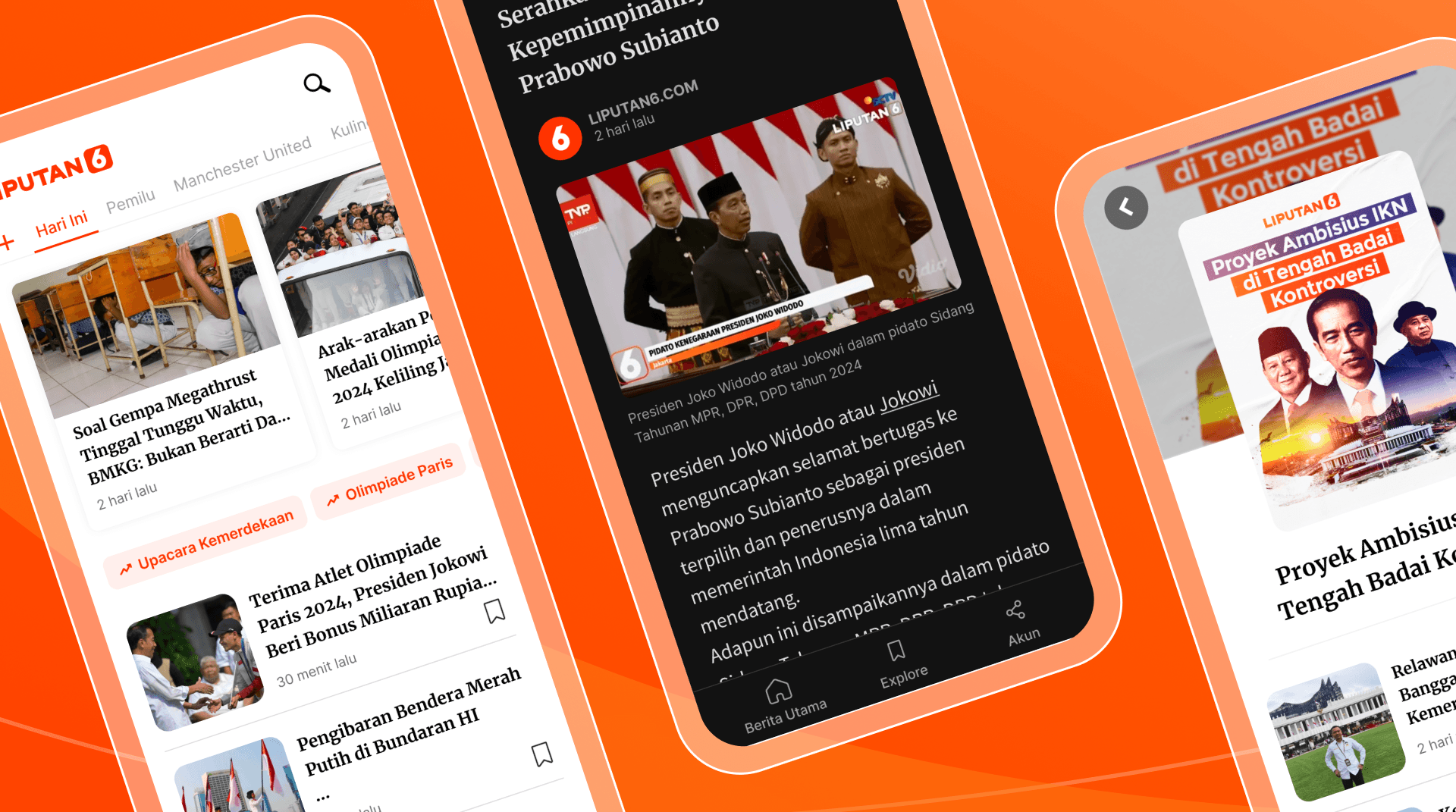
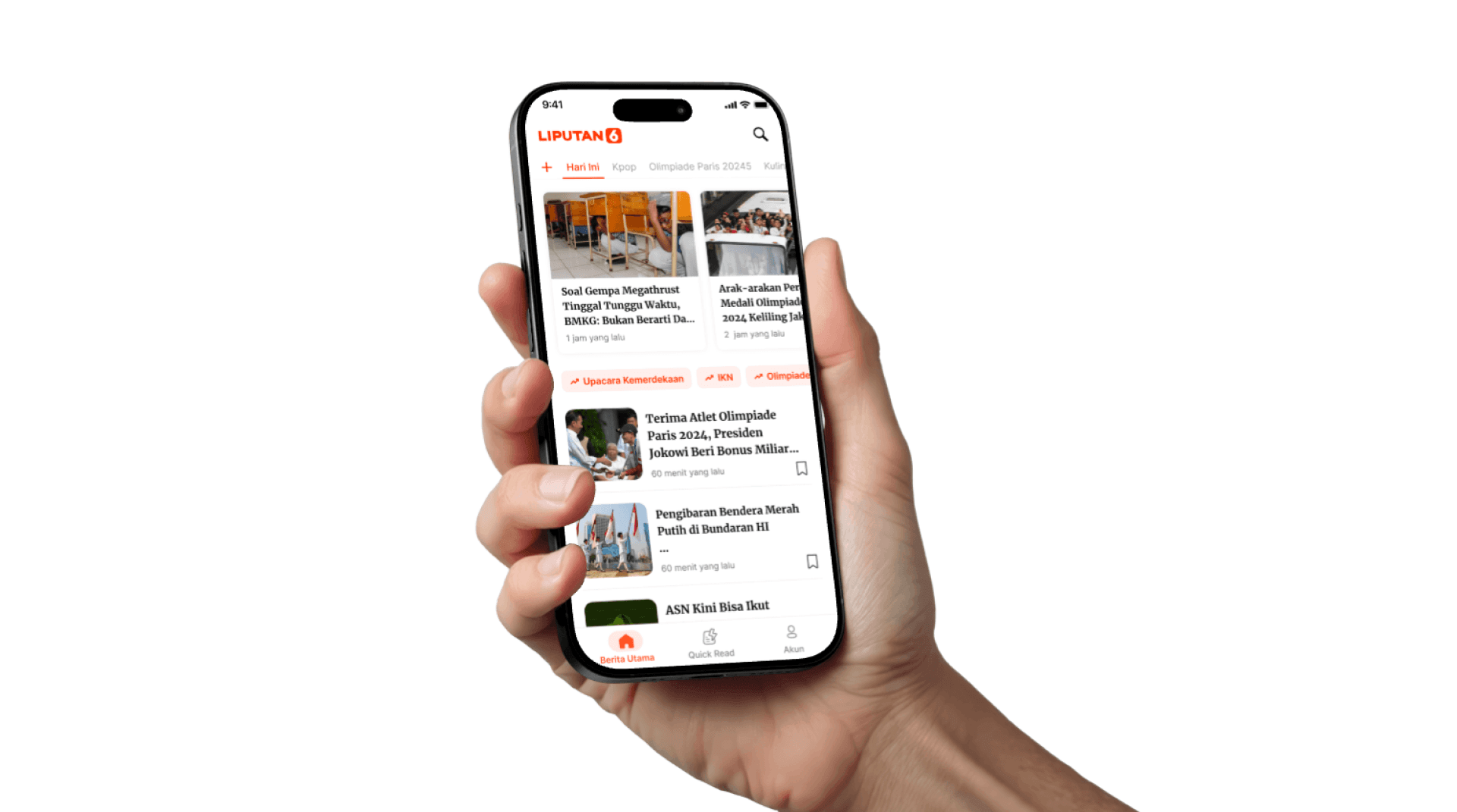
more consistent design
More comfortable reading with a clear hierarchy font
clean
more efficient and faster in creating design
Result
Efectivity impact
By implementing a structured design system, the team significantly reduced the time required to complete design tasks:
This resulted in a 44% increase in efficiency, saving 2 full working days per design cycle — allowing the team to deliver faster without compromising quality.
Consistancy
With the introduction of a unified design system, the overall visual and functional consistency of the app improved significantly:
Reusable Components: Core UI elements like buttons, input fields, and icons now follow consistent styles and behaviors across all screens.
Typography Hierarchy: Font sizes, weights, and spacing are now standardized, making content easier to scan and digest.
Color Usage: A defined color palette ensures visual coherence, enhances brand identity, and reduces confusion.
Iconography: Icon styles are now uniform (e.g., weight and shape), contributing to a more polished and harmonious UI.
As a result, the app not only looks more professional but also provides a more intuitive and reliable user experience — while reducing the time spent on design decisions for recurring elements.