Revamp the Semudahitu landing page to create a more eye-catching, modern design that clearly represents the brand’s identity. The goal is to provide detailed information about the platform’s features in an engaging, non-boring way while ensuring a seamless user experience.
Problem Statement
The old Semudahitu landing page required a revamp due to the addition of more features that were not effectively communicated. The page was text-heavy, making it difficult for users to navigate and absorb information about the platform’s new features. The outdated design also failed to showcase these updates in a user-friendly manner.
Solution
To redesign the landing page with a focus on:
Engaging Design: Eye-catching, modern, and cohesive with the Semudahitu brand colors.
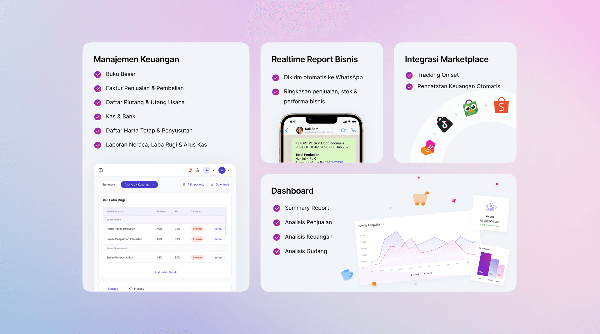
Feature-Focused: Clear and concise presentation of the platform’s features using visuals, icons, and interactive elements.
User-Centered Approach: Ensuring a smooth, intuitive experience that guides users to take action (e.g., sign up, request a demo, learn more about features).
Design Process
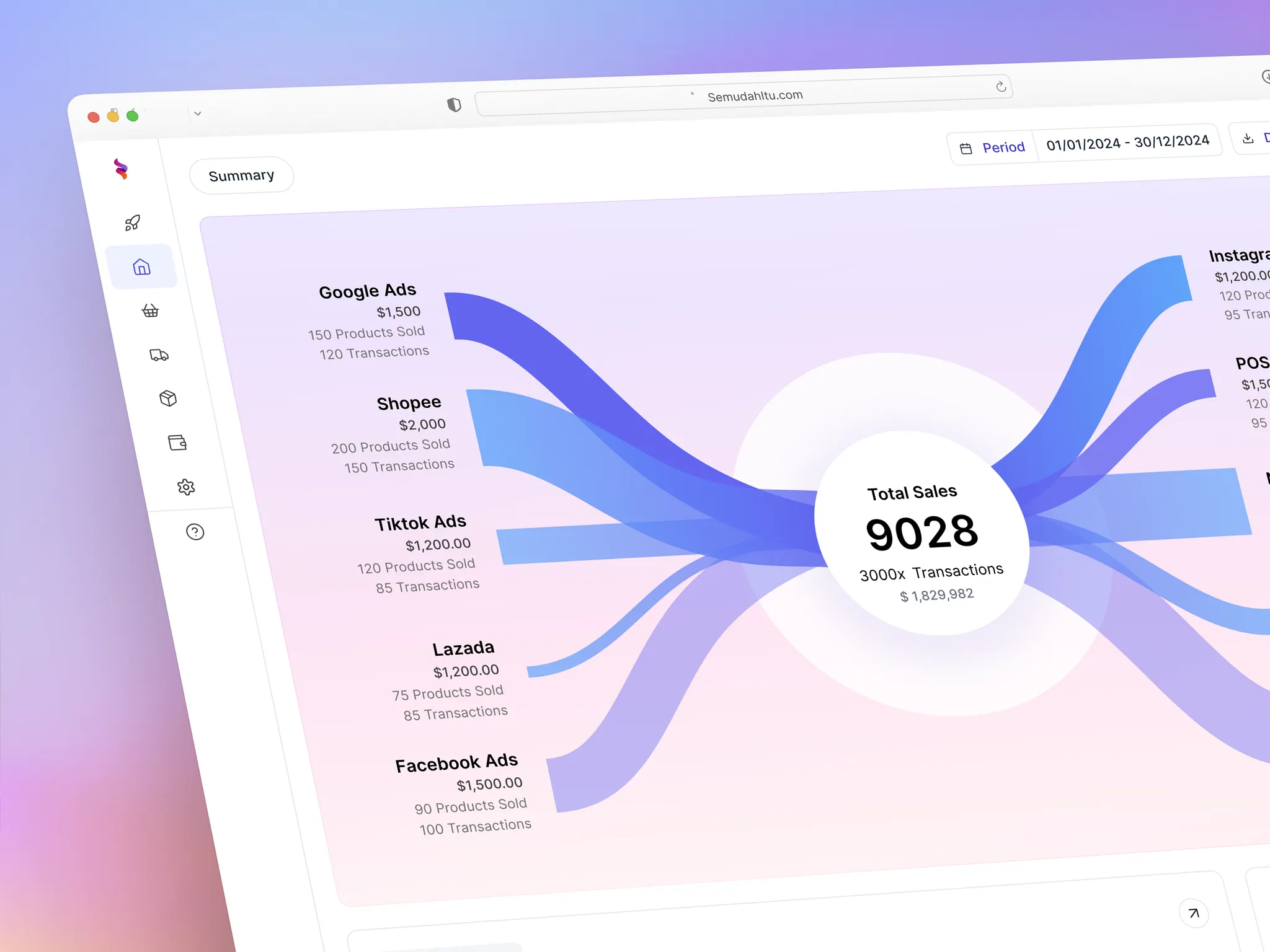
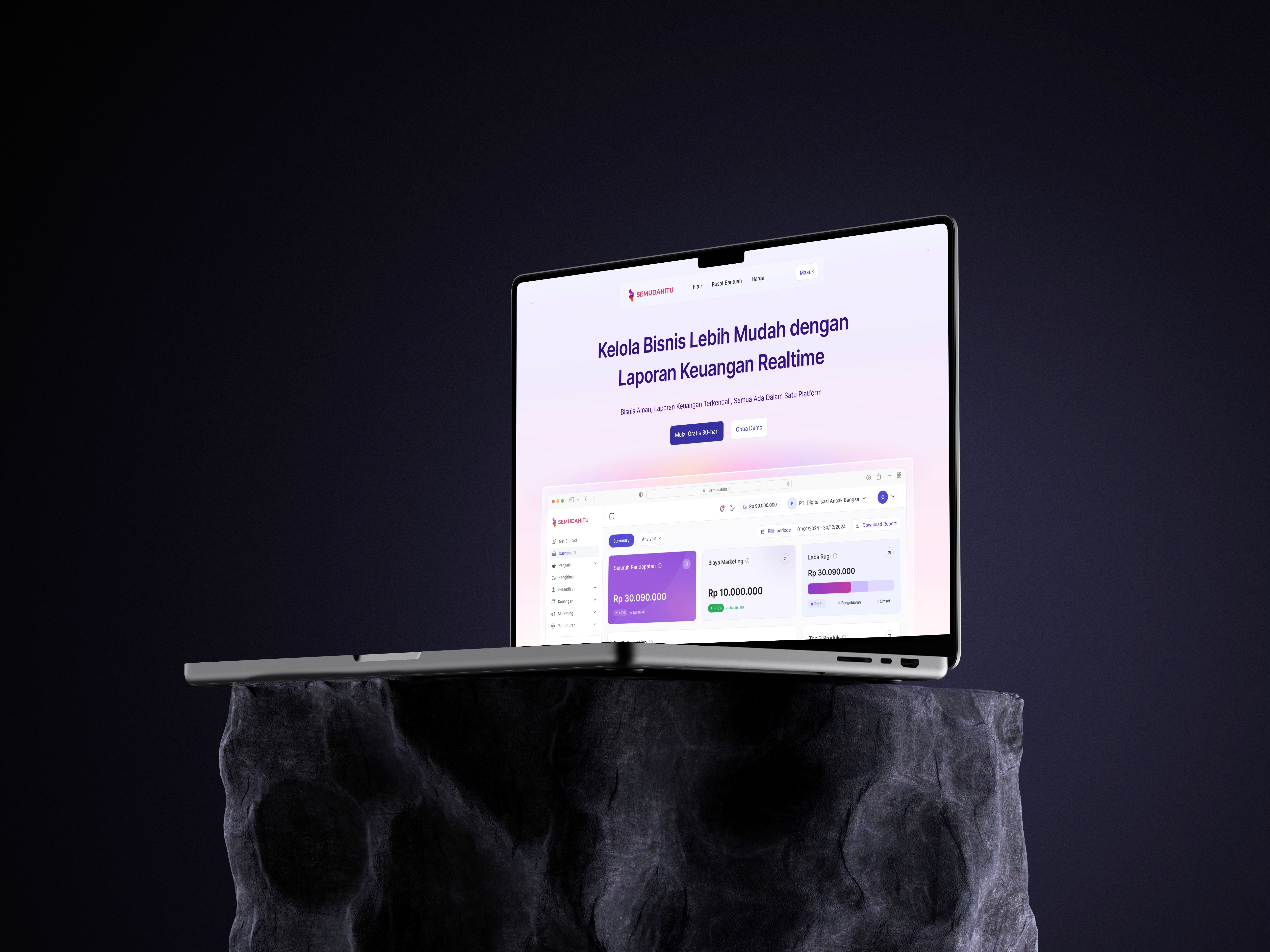
The design process for Semudahitu's landing page revamp followed three main phases. Starting with Research & Discovery, the team reviewed brand guidelines, conducted competitor analysis of ERP platforms, and defined the target user persona as independent mini business owners. This was followed by Wireframing & Prototyping, where low-fidelity wireframes were created before developing detailed high-fidelity prototypes in Figma with interactive elements. The final UI Design phase incorporated gradient colors, glassmorphism icons, clean typography, and custom illustrations to create a cohesive and engaging visual experience. This comprehensive approach resulted in increased user engagement, improved conversion rates, and strengthened brand identity.
Final Outcome
The revamped landing page successfully enhanced user experience, increased conversions, and better communicated Semudahitu’s key features. The new design is visually appealing, informative, and easy to navigate, with a strong emphasis on mobile and tablet responsiveness, ensuring a smooth experience across all devices.
Challenges & Lessons Learned
Challenge: Making sure the page wasn't too crowded with information
We solved this by adding buttons and sliders that let users click to see more content when they want to.
Challenge: Making sure all images looked clear and sharp
We saved all images in WebP format, which kept them looking good while making the files smaller and faster to load.
Challenge: Making the website work well on phones and tablets
Since most people would use phones to view the website, we carefully designed everything to look and work great on smaller screens.
Design Impact
Increased Engagement: By using interactive elements and engaging visuals, users are more likely to explore the features of Semudahitu.
Improved Conversion Rate: With strategic CTAs and a clear user flow, the landing page sees a higher rate of user sign-ups and demo requests.
Brand Identity Strengthened: The design effectively represents the Semudahitu brand through consistent use of gradient colors, glassmorphism icons, and typography.
Mobile & Tablet Optimized: The design ensures a seamless experience on mobile and tablet devices, aligning with the user behavior of accessing the platform primarily via these devices.
Faster Development: By using the Preline UI kit that supports Tailwind, the development process was significantly sped up, allowing for quicker execution without compromising the quality of the design.
Conclusion
This project showcases my ability to transform a dated, static landing page into a modern, user-friendly interface that is both visually appealing and highly functional. The redesign meets the objective of providing users with a seamless experience while effectively showcasing Semudahitu’s features.